A student showed me this when I was complaining about how boring commercials have gotten. You can't get much more interesting than a monkey riding a dog handing out burritos.
Thursday, March 1, 2012
Sometimes you need a monkey
A student showed me this when I was complaining about how boring commercials have gotten. You can't get much more interesting than a monkey riding a dog handing out burritos.
Music
Simple music video that works well, is interesting, and didn't take a lot of resources to film
== Crew ==
Producer: Genki Sudo / Director:Genki Sudo:MAEDAYA / Chife Choreographer:Ryo Noguchi / Video: Takeshi Fukunaga, Retsu Motoyoshi / Hair&Make: Yukari Momotomi(BLOC), Asami Sato(BLOC)/ Coordinator: Mari Koda
Producer: Genki Sudo / Director:Genki Sudo:MAEDAYA / Chife Choreographer:Ryo Noguchi / Video: Takeshi Fukunaga, Retsu Motoyoshi / Hair&Make: Yukari Momotomi(BLOC), Asami Sato(BLOC)/ Coordinator: Mari Koda
Monday, February 20, 2012
Your video is boring
I really hate it when bands I like make crap music videos. I REALLY like both of the songs in the videos below, but the videos are just incredibly boring.
First off, we have Surface by Imperative Reaction. Nothing says lazy and boring like a video that is nothing but the band miming playing instruments. The shots are too tight and the background is boring. It honestly makes it look like they are practicing in their mom's basement.
First off, we have Surface by Imperative Reaction. Nothing says lazy and boring like a video that is nothing but the band miming playing instruments. The shots are too tight and the background is boring. It honestly makes it look like they are practicing in their mom's basement.
director: Chad Michael Ward
Next up is Inhuman by Aesthetic Perfection. While not quite as bad as the first video, it's still rather boring. The location is a bit more interesting, and we no longer have the instrument miming, but we do get Daniel Graves in emo nerd glasses lip synching to someone's bored girlfriend. It could really tell a story, but it just kind of gives up and focuses on Daniel being a rock star. I really dig Aesthetic Perfection, but you have to wonder about a guy that sells t-shirts with his own face on them.
Directed by Max Nadolny
Camera and Editing by Garth von Glehn
Camera and Editing by Garth von Glehn
Something you don't think about
A lot of folks I know do event photography. They do weddings, birthdays, and other such boring events. On a good day, they might get to do a concert or festival. The problem is, a lot of folks who shoot such events forget a major part of the event. The people. When shooting a festival or concert, most photographers focus on the band. Granted, the band is important, but the crowd can be so much more interesting. I used to have a professor who told me that if you want great reaction shots, go to a pro wrestling event. Don't shoot the wrestlers, shoot people in the crowd.
I started thinking about this after coming across a really great set of photos from last year's Kinetik festival. I was at this concert, and this series does an amazing job of capturing the atmosphere of the event. Here's a link to the photo series on Flickr http://www.flickr.com/photos/neonyme/6262319927/in/set-72157627935224606/lightbox/
Here's my favorite photo from the series:

Wednesday, February 15, 2012
Catchphrases and typography
I find video game catch phrases to be incredibly annoying. I really don't care much about what a character has to say, and it's usually repetitive. I do like the idea of turning those phrases into experimental typography. Here are a couple of posters created using only type and simple graphics: http://nerdwire.co/post/17661045265/the-full-series-of-ten-prints-are-available-in-the
This is probably my favorite:
This is probably my favorite:

Sunday, February 12, 2012
Simple
I really like Japanese city logos. They are simple and effective. I really wish more designs would be this clean.

There are some that aren't quite as good. At times the simplification
goes so far that the shape loses any kind of meaning. For example, the
logo of Osaka.
The first logo is for Fujiyoshida, the area where Mt. Fuji is located. It's obvious and it works. Osaka's logo, on the other hand, doesn't really really look like much of anything. It's boring and rather uninspired.
To see more, go here: http://pinktentacle.com/2010/04/50-japanese-town-logos-with-kanji/
Thursday, February 9, 2012
A waste of money
Every semester, when I start talking about business cards, my students start bringing up all the wacky stuff that they have come across on the internet. There are a million gimmicks out there for business cards right now, and they are all useless. One of the most important things to remember with a business card is that it needs to be cheap to produce so you can hand them out like candy. If you spend a lot of money on a business card, you will be less likely to hand them out. If only the "important people" get your card, then you are shooting yourself in the foot.

Overly die-cut card is overly die-cut. Imagine trying to pull this out of your wallet.

Metal cards are cool looking, but waaay too expensive

Business card made of meat. Not useful at all. I can't imagine eating it.
Below are some of the stupid ideas people have used for business cards:

Metal cards are cool looking, but waaay too expensive
Business card made of meat. Not useful at all. I can't imagine eating it.
You're doing it wrong
This video is pretty old, but I still love it. This guy is a complete moron and he does every single thing that you can do to ruin a business card.
Incorrect sizing - CHECK!
Overly gimmicky - CHECK!
Expensive - CHECK!
Lack of information - CHECK!
You, sir, fail at life. If you did this for my class, you would get a nice big F.
Incorrect sizing - CHECK!
Overly gimmicky - CHECK!
Expensive - CHECK!
Lack of information - CHECK!
You, sir, fail at life. If you did this for my class, you would get a nice big F.
Tuesday, February 7, 2012
It wouldn't work over here
Below is one of my favorite commercials from when I was living in Japan. It's a station bump for Space Shower TV, a music television station. I love the idea and the execution, but it would never work in the States. Even though it's promoting a message of peace, it is quite violent. Strangely enough I think the peaceful bit at the end is what most would object to. It seems like most American commercials only can focus on one thing. It's either edgy or cute, never both. It's a dancing baby or the apocalypse, but never a baby dancing in the apocalypse. The question is, why?
DIRECTOR : 丹下 紘希(YELLOW BRAIN)
PRODUCER : 小島 章敬(SPACE SHOWER TV)
COMPOSITOR : 二階堂 正美(NTT MEDIA LAB)
ANIMATOR /CHARACTER DESIGN : 浦上 悠平(YELLOW BRAIN)
SOUND DESIGN : 久保田 敏之(NTT MEDIA LAB)
PRODUCTION COMPANY : YELLOW BRAIN Co.,Ltd.
TOOLS : AVID XPRESS PV、INFERNO、ADOBE AFTER EFFECTS 6.5
PRODUCER : 小島 章敬(SPACE SHOWER TV)
COMPOSITOR : 二階堂 正美(NTT MEDIA LAB)
ANIMATOR /CHARACTER DESIGN : 浦上 悠平(YELLOW BRAIN)
SOUND DESIGN : 久保田 敏之(NTT MEDIA LAB)
PRODUCTION COMPANY : YELLOW BRAIN Co.,Ltd.
TOOLS : AVID XPRESS PV、INFERNO、ADOBE AFTER EFFECTS 6.5
Sunday, February 5, 2012
Gateway to the soul
New series of work I've been fooling with. Trying to create interesting expressions without eyes. It's amazing how the removal of eyes can take something that seems cheery to something very dark.


Transion

second_reality
Stupor Bowl
Seems like every one is freaking out about Super Bowl ads. I don't get the hype. Over the past few years there really hasn't been much worth mentioning. Some companies, like Doritos, have given up hope on the design world and have chosen to go with user created ads. While I don't have problem with this per se, I do have an issue with laziness in the design field. This is a time where designers and creative directors can put something together that really shines. Instead we get lame jokes and bad visual effects. Keep in mind this rant is coming before watching any of the ads for this year. I just remember being so disappointed with last year's batch of ads that I wanted to crack some skulls in the design firms that made them.
At least now I can watch the ads online. Back in the day I had to keep the TV muted during derp ball while I waited for the commercials...
At least now I can watch the ads online. Back in the day I had to keep the TV muted during derp ball while I waited for the commercials...
Thursday, February 2, 2012
Soviet Propaganda
I really dig Soviet era propaganda. Most of it is based around simple illustrations that have almost a vector look to them. Obviously, they were created long before Illustrator was around, but you can still see the influence on contemporary design.


Wednesday, February 1, 2012
Design Firm of the day
Graphic Therapy is a firm that I cam across while doing some research on typography. You've probably seen some of their work around. As I've mentioned before, I'm always shocked when I find a design firm that has created several different designs or campaigns that I'm familiar with.
Graphic Therapy has had some pretty big clients. Disney, Converse, Sony, ZooYork, and a host of others have had work created by them.


Graphic Therapy has had some pretty big clients. Disney, Converse, Sony, ZooYork, and a host of others have had work created by them.

Moby - Go, The Very Best of Moby

ZooYork - Skateboard and Illustration
I will say that I don't care much for their web design. I find their portfolio site to be too slow and most of the web sites in their portfolio seem like print pieces rather than web pieces. To see what I am talking about, you can see their site here: http://graphictherapy.com
Tuesday, January 31, 2012
Gunkajima
One place that I never got a chance to travel to when I lived in Japan was Hashima Island. Hashima Island is also known as Gunkanjima, which means battleship island. The island served from 1887 to 1974 as a coal mining facility. In 74 the mine was closed and the island was abandoned.
What was left is a model for the idea of life after humanity. While some may find this depressing, I find it amazing not only to see what happens to abandoned buildings, but to also see how people take photos of it.


What was left is a model for the idea of life after humanity. While some may find this depressing, I find it amazing not only to see what happens to abandoned buildings, but to also see how people take photos of it.
Here you can see why it's called battleship island. Taken from http://home.f01.itscom.net/spiral/hashima/hashima001.html
Excellent shot taken from http://gakuranman.com/gunkanjima-ruins-of-a-forbidden-island/
Monday, January 30, 2012
Logos I like PART 1
One of the reasons I started this blog is to remember what I have forgotten. I look at a lot of different designs on a daily basis, and sometimes things that I really like are pushed to the back of my mind. So, I'm going to start doing a series on logos I like. Not sure how often I'll do this, but it seems like a good way to get logos I like out of my head and into this space.
LOGOS I LIKE PART 1:


Here is a 3D version of the logo. The added depth and gradation gives the logo an almost completely different look.
LOGOS I LIKE PART 1:

Sabrepulse
Sabrepulse is a chiptune musician from England. He mixes breaks with music made on gameboys. Pretty cool stuff, but not as cool as his logo. Yes, it is a LITTLE complicated, and it wouldn't work well in a smaller application, but it is very eye catching and it looks great on a black t-shirt. Speaking of it being on black, here's a neat variation of it that was used to help promote his "First Crush" E.P.

This version adds some depth to the original, but still has a similar aesthetic. The color scheme has been adjusted to tie in with the look of the graphic.

Here is a 3D version of the logo. The added depth and gradation gives the logo an almost completely different look.
Sunday, January 29, 2012
I'm not a sucker for most brands, but...
I really like Cyberdog clothing. What first caught my eye was their logo.

Below are a couple of different examples of their shirt designs. Their work is quite varied so, if you like what you see, be sure to look at the other designs on their site.


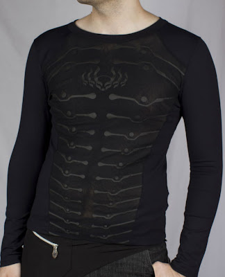
3D Cutaway of the Cyberdog Logo
Cyberdog is a fashion company from England. They make mostly club clothes, but they also have some great t-shirt designs as well. While trying to do a bit of research on the history of the company, I had a bit of a time. It was my hope that I could find out more about the company's designers, but I had no luck. They do have an interesting history though. The company started off as a street stall in the early 1990's. As they grew, they moved to a large underground space in London. Now their clothing is available world wide on website. Sadly, their site recently updated, and now it look like garbage. If you want to see for your self, go here: http://www.cyberdog.net/
Below are a couple of different examples of their shirt designs. Their work is quite varied so, if you like what you see, be sure to look at the other designs on their site.


Saturday, January 28, 2012
NES Box art
So while looking through video game box design, I came across some old NES boxes. I grew up with the NES, and the early box art really jumped out at me. It's simple, it shows a bit of the game, and it's has a bit of a retro futuristic vibe to it. For those of you not in the know, here's an example:

You can see screen shots on the back of the box, but the front of the box also contails a screen shot. The bottom left shows what Nindeno series it belongs to, and of course it has the Nintendo seal of quality. There is a bit of weird dead space in the middle of the bottom half. I never noticed it when I was younger. I guess I was focused on the top half of the box.
Now, this is the official Nintendo box. Or at least the box they started with. Over the years they changed, and there were a lot of other companies with other types of box art.
Here's a pretty good write up on the other styles of NES era box art http://thisischris.com/feature/2003/boxart.html
If you are feeling inspired by this, and I know I am, you might want to design an old school box of your own, well, here you go: http://www.thecoverproject.net/uploads/TEMPLATES/UGC/Nintendo%208bit%20Template%20-%20Shenske.psd
Friday, January 27, 2012
It's all been done
The other day while pointing out how two game boxes looked quite a bit alike, a friend mentioned that there is an entire site devoted to repeated movie posters. After a little digging I found the site. It's in French, but you can look at the images and get the idea. http://christophecourtois.blogspot.com/search/label/cin%C3%A9ma
Here is one of the examples off of the page:

Now, I do agree that these all look the same, but I'm wondering the reason. People like things they are comfortable with. People like repetition. Just look at any of the reality shows that are popular now or sitcoms that were popular back in the day. They are all the same thing over and over.
Now, the question is, is it the designer, the creative director, or the studio?
Studios are notoriously known for not wanting to take chances. Using repetition is safe. If it worked once, it can work again. Creative directors, while boring at times, would usually push the idea a little farther. The graphic designers probably have very little say in the matter. So, I'm going to go with blaming the studio. That's a pretty easy out, but it's probably the truth.
The last option, which is tempting as well, is that it has all bee done. There are so many movies made each year that there is no possible way to create an original poster. A designer could spend years looking through archives trying to make sure his or her work is unique only to find out that the exact same idea was used in a French poster from the 70's.
So the question is, are there any original designs left?
Thursday, January 26, 2012
Good Design Gone Boring
I really dig Trollbäck + Company. They do some amazing video work and have clients that most of us can only dream of. You may remember that I posted their Cooking Channel bumps awhile back. If you are like me and you watch a lot of cartoons, you may also be familiar with this:
Collage of Nickelodeon 2010 Rebrand
Trollbäck + Company
While doing research, I decided to peruse their website to see the other things that they do. First off, their site is incredibly boring. They are lucky that they have such a large name, because if I was looking at the site I would never hire them. Secondly, their print work is BORING! To see what I mean, go here: http://trollback.com/print/
I know they are more famous for their video work, but how can you be so innovative in one area and be complete crap in another? We get it. You really like helvetica. How about trying another font? If one of my students came to me with a portfolio filled with work containing pretty much only one font, I would fail them.
Maybe the advice here is stick to what you are good at. Everyone has a specific skill set, and while it doesn't hurt to try other things, maybe you shouldn't show those things in a public forum.
Stop motion
There has been a lot going around the interweb about the bookstore stop motion video. Don't get me wrong, it is cool, but I think it's been talked about a bit too much. In case you missed it, here's the vid:
Again, this is very well done, and it must have taken a long time, but it's not really that innovative. There's nothing that really wowed me about it. Part of that might be my cynical nature, or the fact that I've seen a lot of great stop motion. I believe a lot of the people going gah gah for this video haven't really looked at any other stop motion. Here's something that I find a little more interesting.
Here we have the same technique, but it's been pushed further. The idea literally jumps off the page.
One last example. This one is simple but, again, it is trying something a little bit different. Also I dig that song, so that helps...
Tuesday, January 24, 2012
Original fonts
I always encourage people who are creating work to slightly change the fonts they are using. Most people don't listen to me and simply just type whatever they want to say without making changes. This is fine for body copy, but if you are making a logo or a headline, why not play with it? Try to avoid mistakes like this:

The font, Homoarakhan, was used for the initial launch of the PS3. Forums lit up with font lovers who were more than willing to point out the fact that it's the same font used for the Spiderman film franchise. Over the years, Sony slowly changed the font to get away from the Spiderman look.

Some people believe that it was lazy design. That probably was part of it, but I think it's also a lack of research. I wonder if the people who came up with the logo even realized that it was the same font as the one used for the Spiderman films.
Personal work
I've been trying a few things with my own work. At the moment, my focus has been my art work. I really dig technical line work, so I've been attempting to tie it into what I do. Here are a couple of new pieces:


Saga 2012

Kiss of Life 2012
Sunday, January 22, 2012
Logo, color, brand
One of the first times I really remember thinking about the idea of a brand was when I started noticing Red Bull. They have a distinct font, color combination, and set of branding icons that they use across products.
Let's start with the logo:
 The Red Bull logo was conceptualized by Dietrich Mateschitz, the owner of Red Bull. While on vacation in Thailand, he had a beverage called "Krating Daeng" which translates to Red Bull. One of the things I find interesting about the logo is the fact that it breaks a lot of design rules, but is still effective. Typically, logos shouldn't have the small details that are on the inside of the bulls. The reasoning for this is that such details typically get lost on smaller designs. Red Bull gets around this by using the type face for smaller applications. The other rule it breaks is the color scheme. The colors are faded, which typically makes a product feel dated and tired. In this logo it works because if it were pure red and yellow, it would be overly stimulating.
The second thing that really gets me about Red Bull is their branding:

Typically packages and branding revolve around the color of the logo. Here we can see that Red Bull brings in a third and forth color to their brand. In addition to the reddish pink and orangy yellow, we have blue and silver. The silver saves the color scheme from becoming too much like an American flag, and the blue goes back into space pushing the logo forward. This color scheme is used on everything from clothing to packaging and even sponsorship on race cars.

Let's start with the logo:
The second thing that really gets me about Red Bull is their branding:

Typically packages and branding revolve around the color of the logo. Here we can see that Red Bull brings in a third and forth color to their brand. In addition to the reddish pink and orangy yellow, we have blue and silver. The silver saves the color scheme from becoming too much like an American flag, and the blue goes back into space pushing the logo forward. This color scheme is used on everything from clothing to packaging and even sponsorship on race cars.

Saturday, January 21, 2012
Simple and effective
A lot of people that I've worked with or talked to think that design should be complex. I agree with this to a point. Something can be just as complex by being simple. What I mean is that by taking something that is a complex idea and simplifying it, you have something that can be clean and aesthetically pleasing. The logo animation for the Cooking Channel is an excellent representation of this concept.
Cooking Channel Brand Identity by Tröllback + Company and Joanne Harmon, Scripps Networks
Here we have the simplification of the measuring cup, a common cooking tool, to represent the company in a simple and effective manner. While watching this we get the idea of the measuring cup without seeing the measuring cup. What we don't see makes it complex because it makes us think about what it is in reality.
Below is a further simplification of the logo animation. I feel like it's not as effective as the measuring cup version, but it is still effective as an animated logo.
Cooking Channel Brand Logo Animation by Tröllback + Company and Joanne Harmon, Scripps Networks
Friday, January 20, 2012
MK12
MK12 is a design firm I discovered a few years ago. They really make good use of negative space, line, and typography. The work is simple, but effective. Another reason I like them is because they, unlike many others, successfully translate their print aesthetic into the look of their video work.


Flowers
The Faint - Agenda Suicide (Banned by MTV)
It's pretty easy to tell that both pieces were created by the same group. This is something I strive for in my personal work, and something that I think a lot of designers that cross platforms forget about. Your work must look like you made it. It must have continuity.
Thursday, January 19, 2012
Simple and Clean (No, not that Simple and Clean)
Video students always ask me about how to make music videos with limited time, budget, and actors. Most want to have the actual band in the video. This is a feat that is near impossible. Beyond that, videos with the band playing music are incredibly boring. I don't mind a shot or two of the band doing their thing but, to me, nothing is worse than sitting there for three or four minutes watching some guy/girl trying to be cool/sexy.
Omodaka, a design and music group from Japan, work around this quite well. This video is simple, effective, and could be done with one camera, a green screen, lights, and basic editing software.
Omodaka, a design and music group from Japan, work around this quite well. This video is simple, effective, and could be done with one camera, a green screen, lights, and basic editing software.
kyoteizinc (video mix) / omodaka (far east recording)
dir.: hiroshi kizu (P.I.C.S.)
dancer: masako yasumoto
dir.: hiroshi kizu (P.I.C.S.)
dancer: masako yasumoto
This one is a little bit more complicated, but it's such a great video, I had to include it.
Kokiriko Bushi - omodaka
dir.:teppei maki
dir.:teppei maki
Wednesday, January 18, 2012
Papyrus, worst font ever?
I know there is a lot of hate out there for Comic Sans. Yes, Comic Sans is a horrible font, but it doesn't offend me as much as Papyrus. You've probably seen Papyrus. Lots of people use it because, I guess, they think it looks classy.
The font was created back in 1982 by Chris Costello, but it seems to have really come into vogue over the past few years. I can't be certain, but it seems to be a font that is being used by a lot of vinyl printing companies.

Now, Papyrus does have it's place. I think it's fine if you are doing something related to Egypt, but that's about it. I've come across it being used for everything from lawn services to day care. I don't get what people are thinking when they choose it for such things but, I have to assume, that they are not designers.
Here are a few confusing uses of the font:


The font was created back in 1982 by Chris Costello, but it seems to have really come into vogue over the past few years. I can't be certain, but it seems to be a font that is being used by a lot of vinyl printing companies.
The offending font
Now, Papyrus does have it's place. I think it's fine if you are doing something related to Egypt, but that's about it. I've come across it being used for everything from lawn services to day care. I don't get what people are thinking when they choose it for such things but, I have to assume, that they are not designers.
Here are a few confusing uses of the font:

Hopefully this trend will die out in the near future....
Tuesday, January 17, 2012
Groovisions
Lately I've seen a lot of designers using the info graphic look in their work. The first place I remember seeing it was in the video for Halfby's Rodeo Machine. The video was created by Groovisions, a Japanese design group. You can see their work at http://www.groovisions.com/
Here's the video:
Here's the video:
Rodeo Machine
Here's another video they made in the same style. Even more info graphic goodness.
Ensuring the Future of Food
Monday, January 16, 2012
I am the bat
So I was watching Batman the Animated Series today and noticed something. In the episode "His Silicon Soul" there are several nods to other bits of sci-fi.
One of which is the character of Karl Rossum, To borrow from Wikipedia, "Karl Rossum was based on the actor William Sanderson, both his voice and image were taken for the character. Loosely connected to his role as J.F. Sebastian in the 1982 film Blade Runner, Sabastian created the minds of the androids and surrounded himself with robot friends to keep him company."
Very cool.
Next is the obvious nod to Terminator. About mid way through the episode cyborg Batman gets his wires crossed. His vision goes red and certain electronic devices highlight and zoom like they do in the Terminator films. Also, there is what happens to Batman at the end of the episode.

Bat Terminator
Now for the thing that makes this relevant in a design blog. The logo for HARDAC is borrowed from The Designer's Republic. Sadly I had a difficult time finding the logos that I was looking for, but you should be able to get the idea.

HARDAC Logo

Wipeout 2097 Soundtrack (UK VERSION)
Not exactly the same, but you can definitely tell that the folks making Batman at least glanced at this logo before designing the HARDAC logo.
Sunday, January 15, 2012
Models aren't WYSIWYG
Below is a more serious variation of this same idea. It's a real commercial created by Dove. I think it's great and all, but it seems like Dove could do more with the advertising. Quite honestly, I'm wondering how long it will be before there are disclaimers at the bottoms of advertisements stating that models have been Photoshopped.
Saturday, January 14, 2012
kidrobot
So I was out and about today looking for interesting shirts, I have a bit of a thing for odd t-shirts, and I came across some neat stuff by kidrobot. Their logo is what really caught my eye.

Sadly, they didn't have the design that I wanted in black, so I passed. Their website does have some neat stuff. Looks like they use professional artists and designers to come up with their shirts. Hopefully the money is making it back to the folks that came up with the design.


kidrobot logo
Sadly, they didn't have the design that I wanted in black, so I passed. Their website does have some neat stuff. Looks like they use professional artists and designers to come up with their shirts. Hopefully the money is making it back to the folks that came up with the design.

Logo variation for kidrobot toys
Friday, January 13, 2012
Friday the 13th is a perfect day to start this.
To start from the start, I guess I can go back to the first thing that I saw that made me want to be a graphic designer. Wipeout for the PS1


Wipeout cover art
The game was really cool, but what got me was the design of it. Each team had a logo, and they were all interesting.

Team Logos
After doing some research, I found out that the work was created by The Designer's Republic. I'll be posting more about them in the coming days.
Subscribe to:
Comments (Atom)